Tuesday, 31 October 2017

OUGD601 | Packaging Research - 'Outside the Box: Cardboard Design Now' by Michael Czerwinski & Santiago Perez

Czerwinski, Michael & Perez, Santiago. 'Outside the Box: Cardboard Design Now.' Black dog Publishing, London U.K. 30th September 2010.

Researching on case studies of recyclable paper packaging designs. Especially the ones which are sustainable and eco-friendly. 

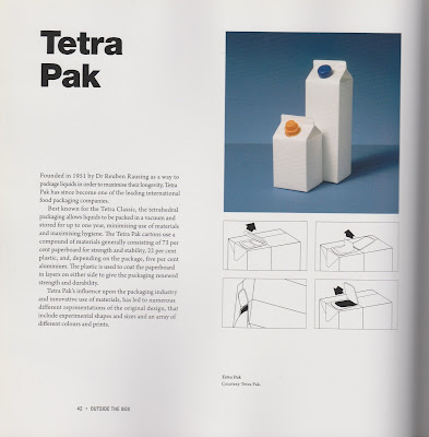
Tetra Pak - page.42
Founded in 1951 by Dr Reuben Rausing as a way to package liquids in order to maximise their longevity, Tetra Pak has since become of the leading international food packaging companies. 
Best known for the Tetra Classic, the tetrahedral packaging allows liquids to be packed in a vacuum and stored for up to one year, minimising use of materials and maximising hygiene. The Tetra Pak cartons use a compound of materials generally consisting of 73 percent paperboard for strength and stability, 22 percent plastic, and, depending on the package, five percent aluminium. The plastic is used to coat the paperboard in layers on either side to give the packaging renewed strength and durability. 
Tetra Pak's influence upon the packaging industry and innovative use of materials, has led to numerous different representations of the original design, that included experimental shape and sizes and an array of different colours and prints. 


Raw Edges - page.43
Design studio Raw Edges, founded by Royal College of Art Product Design graduates Yael Mer and Shay A in 2007, have gained recognition for their range of products, from the bags and luggage designed for Chinese company Kobold in 2007, to 2006's British Council Student award-winning Milk Cartons, exhibited at the Talented: Graduate 2006 design festival in Milan. 
Milk Cartons uniquely distinguishes between different levels of fat content in each variety of milk by the form of each pack, rather than colour. The length and taper of the folds on the front of each pack denote whole, skimmed or semi-skimmed milk and conceal the spout, which folds out from the top of the carton, with similar folds on the back actin as a handle with which to grip. 


Wewow - page.44
Wewow are a CD and DVD replication company with a deep concern of the way their products are packaged. Motivated by the environmental impact of traditional plastic packaging, the company have created an entire portfolio of eco-friendly packaging solutions  under the name of WoEco. The innovative range avoids plastic completely in favour of using sustainable cardboard and other natural materials. Any inks used in printing the cardboard are vegetable-based, where possible, and the use of matt or gloss laminated is also avoided. The image below is the WowSpiral, originally designed for a folk artist Peter Rose's EP The Merry-Go-Round, but now is a staple of Wewow's packaging services. Its deign embodies the company's principles of simple, creative, eco-friendly, and cost-effectivepackaging. The spiral's distinctive shape leads it a unique and pleasing atheistic who,e comprising just one single piece of card, which folds to form a secure, spiral-shape clasp. Not only does this minimise the amount of material used, but it also means that no glue is required to stick separate pieces together. 


adónde? - page. 54
French design firm adónde? pride themselves on their green credentials, with their cardboard products - Boîtes and Boîte à lumière - being made using recycled cardboard and FSC certified coloured paper. Boîtes feature seven "do-it-yourself recycled cardboard boxes" which are intended to be used to hold stationary and other desktop items. Sold in many different colours, all depicted in a colour bar featured on their elegant brown paper packaging - evocative of the cardboard product within - alongside simple diagrams of the various uses and constructions possible with the cardboard templates. The firm's Boîte à lumière - a fully functioning series of cardboard lamps - work on a similar premise as Boîtes, with their continuation of colour, and similarities in materials, shape and construction; they also continue to promote the company's commitment to proving cardboard as a versatile material used in well-designed product. 


Monday, 30 October 2017

OUGD601 | Packaging Research - 'Some Of The Most Creative Sustainable Package Designs' - Online Article by Bogdan Sandu

Sandu, Bogdan."Some Of The Most Creative Sustainable Package Designs" Inspiration - 2016. Design your way. http://www.designyourway.net/blog/inspiration/some-of-the-most-creative-sustainable-package-designs/. 

Some Of The Most Creative Sustainable Package Designs
  • Sustainable common word nowadays - due to the hyper-industrialisation and the rapid use of various materials which are running out quickly. 
  • Package designers and many others are trying to use their products materials which are not petroleum based. 
  • The alternative are materials which will not run out quickly. For example: Paper, wood or other organic materials. 
  • Within this article these kind of organic materials, including recycled plastic. 
  • Recycling materials like plastic, metals or even paper is an idea that should be imposed in many countries, otherwise they won't recycle. 
  • Sustainable package designs like these will preserve their uniqueness instead if being common. 
  • Images below of these sustainable packaging designs. 


Thursday, 26 October 2017

OUGD601 | Packaging Research - 'Best Practices for Graphic Designers, Packaging: An essential guide for implementing effective package design solutions Flexibound' by Grip

Grip. 'Best Practices for Graphic Designers, Packaging: An essential guide for implementing effective package design solutions Flexibound'. Rockport. 15th December 2013

Examining the book to find case studies of sustainable packaging examples.

Editorial note: While we recognise the inherent waste that comes with most packaging and our role in this, we feel a grave responsibility to use what power we have to steer clients into thoughtful decisions about the role their packaging plays for future generations. 

From milk jugs with printed ones to cut and becomes dustpans, to use lotion bottles repurposed into beach-friendly phone and money containers, the possibility for life after delivery is endless. 

We live in a world of finite resources, and recognising this is part go becoming a great designer. As with aesthetic decisions, every choice matters when speccing a new project. The initial phases of package development are the easiest time to set goals and standards for environmental impact when the job is finished.

BRUKETA & ŽINIĆ, CROATIA, Brokula & ź - Page. 24 - 25
Brokula & ź (Broccoli & Ź) is a clothing brand by Brunet & Žinić OM, made organically grown materials, Brokula & Ź believes everything good comes from within, so all the clothing contains hidden messages written on the side that can only be seen only by you... and whoever undresses you. 

There is funny dialogue between Brokula (Broccoli) and Ź (a bird), which are the main characters of the product's visual identity. Like the products themselves, the packaging is also eco-friendly and was designed to be easy to assemble, without any glue or plastics. The inks have ecological certificates, and the paper is recycled. Furthermore, the packaging is designed as a cup that you can use for something else after unpacking your purchase. 

'The packaging had to be as eco-friendly as possible to align with the product and accurately represent the company's commitment to sustainability. When the packaging feels like an extension of the product, it adds value. In this case, the packaging serves many purposes, from emotional to tactical. In addition to the ecological considerations, the packaging has to serve as a fun gift wrap and a practical protection of the product.'


ONE VILLAGE COFFEE, Able Design, USA - page. 38 - 39 
One Village Coffee (OVC) is a specialty roaster located outside Philadelphia. Their goal when they opened three years ago was to direct some of their profits to nonprofit partners in a small village in Nigeria. 

"We knew there would be a lot of people that would be interacting with the bag, so we needed try and capture that diversity," Ash explains; Prior to this bag, the packaging had been, mostly a maroon colour. 

There's only one version of the new package, making its more economical. Label are added to the bag to denote the roast and favour profile.


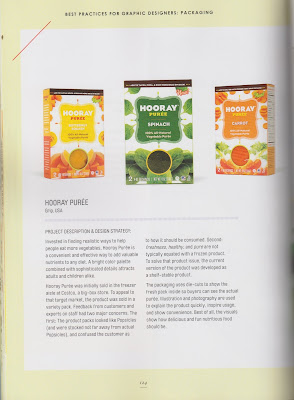
HOORY PURÉE, Grip, USA - page. 124 - 125
Invested in findling realistic ways to help people to eat more vegetables, Hooray Purée is a convenient and effective way to add valuable nutrients to any diet. A bright colour palette combined with sophisticated details attracts adults and children alike. 

'There were no direct competitors for Hooray Purée, because it's the first of its kind to be sold in stores. The challenge of a new product type is explaining what explaining what exactly the product is, what it can be used for, and how to do so. Hooray Purée solved that through highly styled food photography incorporating the product in a home kitchen-like setting. Current testing will determine if the products will be sold in the natural food aisle or the produce aisle. 


STAFIDENIOS, Matadog Design, Greece - page. 148 - 149
Stadidenios is a raisin product pack for kids and made in Greece. The packaging dimensions are designed to fit into a kid's cupped hand. Research in a world market study showed that all raisin packaging had the same motif. An opportunity in the consumption chain for extended packaging use was then identified. The paper is reusable - kids can make paper toys our of the inside of the box. It's an added gift to the buyer and still adheres to the production budget. 

'Matadog Design encountered and solved many technical challenges in paper, artwork, and die-cutting due to the product size. To do so, they had to explore how paper toys were made to identify the pros and cons of the construction process.'


MARICA'S ECO-JUICES, Bruketa & Žinić OM, Croatia - pages.150 - 151
Marica's Eco-Juices are produced by Marica Jug on her family farm, just outside of Naśice, Croatia. The bag-in-box packaging was conceived and designed by Bruketa & Žinić OM. The juice is made from organically grown fruit, without any additives, except a lot of love. It is based on cold pressed apple juice, with a range of interesting flavours, such as elderberry, mind, blackberry, and pure sour cherry juice. To bring the sorry behind these juices closer to consumers, illustrations of a day in the life of Marica are used on packaging. 


Tuesday, 24 October 2017

OUGD601 | COP3: Tutorial 1 - Group Tutorials 'Organising Your Research Project'

First tutorials is within small groups as the feedback was quite general. Nevertheless future tutorials will be 1-2-1 and will follow the structure outlined on eStudio. 

For example, the aims of this first tutorial are:
This tutorial should focus on clarifying the students Research Question. Refer to the General CoP3 advice and ‘Organising Your Research Project’ lecture if necessary. Students should attempt to complete a revised CoP3 Proposal if their direction has changed significantly over the Summer. Students should agree an outline of the chapter structure of Dissertation with their supervisor. Students should also agree a rough timeline for the development of the practical element of the module. It is essential that students make contact with Academic Support at this stage, if this will be required.

To bring to the following to the tutorial:

  • CoP 3 Proposal - please make sure that this has been updated with any extra work you have done on it
  • Outline of Chapter Structure - who/what are you reading, what are the main arguments you wish to cover
  • Timeline for the development of practical work for the module
  Below is a draft structure of my dissertation: 


Sunday, 22 October 2017

OUGD601 | Packaging Research - 'Color Harmony Packaging' by Origin

Mousner, Jim. (AKA: Origin). 'Color Harmony Packaging.'Beverly, Massachusetts USA: Rockport Publishers, inc, 2008.

Introduction - page.8 to 9

  • We live in a society that has made the act of purchasing products a celebration. Shopping has transformed from gathering the basic necessities to a multi sensory experience, with the environment and products themselves merging into single presentation. 
  • Retail environments have become highly evolved, creatively engineered, and even subversive. They are designed to house and deliver these products to the marketplace and serve as showrooms for seemingly endless sea of brands, marketing. imagery, and products. 
  • As designers, this evolution of consumerism has opened doors to freedom and expression, challenged us with engineering and manufacturing technology, and required responsibility and restraint in a world overflowing with packaging possibilities. Despite contemporary techniques and technology, it is critical to not underestimate the power of the core elements of design in packaging - especially colour. 
  • Packaging engages the consumer on multiple levels, from the informational to the emotional. Whether in a large retail setting or an intimate boutique, successful packaging is as important as successful marketing. Good packaging communicates and entries consumers to try something new. 
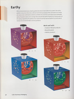
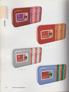
Earthy - page.56 to 65
  • With environmental issues drawing global attention to the health of our planet, the earthy palette is now, more than ever, a relevant and robust grouping of the colour spectrum. Simple, yet coarse colour combinations reminds us of where we came from, and where we are ultimately going. Turquoise waters, burnt orange skies, and red clay earth all signify the characteristics of this group. Inspired by the palette of our world. The earthy hues are perfect for partially all natural and environmentally-conscius products.