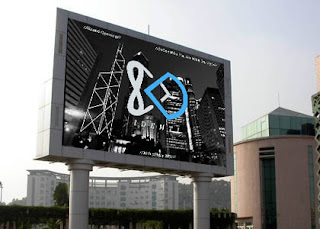
In conclusion, I believe I could of done slightly better with this practical brief. I struggled and found it quite a challenged due to my essay, as I found it difficult for me to think of some ideas on who to show that my essay answer can also be answered by practical work which links to my own words. (What is the relationship between branding and the consumer self).
Because of this difficulties of the essay, I believe it did slow me down by quite a bit with doing the practical work of it. If I had enough time I would of done some screen printing on some t-shirts, poster and business cards to make it more professional and realistic. As I am promoting my brand ‘identi’ like other high street fashion retails to get a brand identity
that every one can easily recognise.
I do like how my logotype for ‘identi’ matches well for both genders. As it means ‘ID’ for ‘identi’ linking to my essay answer for the question. And the meaning of symbols relates to each gender. Infinite and heart shape meaning female and D simple meaning durable for the male.
The colour scheme is quite powerful as I did some research on colour psychology. Which is explained on my blog and previous design boards. That companies do this as they know how colour has emotion factors for humans.


No comments:
Post a Comment