In conclusion, I believe I could of done slightly better with this practical brief. I struggled and found it quite a challenged due to my essay, as I found it difficult for me to think of some ideas on who to show that my essay answer can also be answered by practical work which links to my own words. (What is the relationship between branding and the consumer self).
Because of this difficulties of the essay, I believe it did slow me down by quite a bit with doing the practical work of it. If I had enough time I would of done some screen printing on some t-shirts, poster and business cards to make it more professional and realistic. As I am promoting my brand ‘identi’ like other high street fashion retails to get a brand identity
that every one can easily recognise.
I do like how my logotype for ‘identi’ matches well for both genders. As it means ‘ID’ for ‘identi’ linking to my essay answer for the question. And the meaning of symbols relates to each gender. Infinite and heart shape meaning female and D simple meaning durable for the male.
The colour scheme is quite powerful as I did some research on colour psychology. Which is explained on my blog and previous design boards. That companies do this as they know how colour has emotion factors for humans.
Wednesday, 18 May 2016
Thursday, 12 May 2016
Essay Practical Work - Final Design
Here are the final resolutions of my brand ‘identi’. As I mention previously that I will make physically some of the advertisement promotions in physical forms such as: Poster, Business cards and leaflet.
Overall, results were good. The resolutions of the leaflet, poster and cards came out of the printer well. No mistakes were made nor any changes in case of spelling. I believe this final piece with the mock up pieces of the shop and t-shirts work perfectly well together as a whole.
If I had more time, I would of like to screen print some of my logotype on some t-shirts. Because that will demonstrate how it is a high street retail shop. Having similarities with other existing high street brands e.g - Superdry, Calvin Klevin etc. Any that just say the logotype name ‘identi’.
Tuesday, 3 May 2016
Essay Practical Work - Mock ups
Here are some more development images of my brand ‘identi’. Again following from the colour scheme, I have tried to incorporate these into an advertising of a brand new retail store opening soon.
In the following images, I have done mock ups of my brand ‘identi’ being in forms of advertisement for promotions. Such as Poster designs T-shirts designs for both genders, business cards, flyers for customers to find where the grand opening of the store will be.
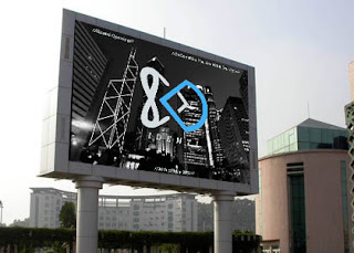
And finally a poster, I have also made it in a billboard to visually see what it will look like outside. I also wanted another mock up on how the logotype and chosen typeface would look like on a glass store.
Overall, I think it looks very good. It has a sci-fi sort of look but looks very distinctive compared to other high street retail. I mostly got inspiration from the other high street retail shop ‘Superdry’ for this kind of concept. As they use Tokyo for their signature place, I have used Hong Kong.
I will make some of them physical products like the leaflet, poster and business cards.
Subscribe to:
Comments (Atom)


